- The Publication
- Support/Advertise
- Archives
- March 2018
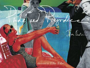
Pride and Prejudice
June 25th, 2016 | Published in June 2016
Multi-talented and sophisticated, Cincinnati artist Ellie Fabe (a singer-songwriter, too, who most recently sang both at The Taft Museum of Art and at Southgate House), has put her formidable abilities in a new direction: she’s reinterpreted Jane Austen’s Pride and Prejudice through her own artwork, and the results are charming, astute, brilliant. The idea itself is exceptional: Fabe, who’s long been known for her watercolors and/or collages which mainly deal with and/or interpret memory, has combined those two genres in her limited edition book to extraordinary effect. Fabe, long a haunter of old magazines, mainly from the l950s, and a truly astute interpreter of the roles that women played as seen through magazine images (which she compares to the paper dolls of her childhood in her introduction to her version of Pride and Prejudice–the text is Jane Austen’s, but the images are Fabe’s). Fabe is one of the best interpreters of nostalgia and sentiment, but her images for Pride and Prejudice are also both witty and lively, with an edge of occasional sadness, or really tristesse, which underlies her entire aesthetic sensibility.
Fabe’s watercolors are generally created by making a kind of frame from watercolor, the edges of which are never straight, and thus create the sense of a photograph that’s in process of being staged and created concurrently. She tends to mainly bright colors in her interpretations of Austen’s characters and plot in her new book, and then chooses images of both women and men, again mainly from the early to mid l950s (some may be as early as the ’30s and ’40s) and cuts them out of magazines, collages them onto her watercolors, so that they also have the feel of stage sets and renderings for fashion design. Fabe, who’s truly brilliant, is able to combine all these elements from popular culture, lift them into Austen’s text for Pride and Prejudice, and thus offer her readers a true combination of fine art and popular culture. I mention that because popular culture’s in the process of simply taking over the fine arts, and that fine tension between the two cultures that first surfaced in the late ’60s is falling into a kind of reification of popular culture, thus giving it more resonance than it often deserves, while dethroning centuries of fine art and/or (in this case) fine literature as little more than a backdrop for pre-feminist “dead white men” art (a quote one often hears from certain feminists). Thus, Fabe’s collaged interpretations of the characters and scenes in Pride and Prejudice return that dialectic between fine art and popular culture in one of the best interpretations of the two in decades. Fabe’s book is very smart, and her stage set/characterizations are equally astute, clever, and shrewd. Fabe understands Austen’s characters well–she mentions in the introduction that reading Austen’s novel always reminds her of people she knows or has known in her own life, and Fabe’s understanding of the roles of women in Austen’s world and in the world of Fabe’s own childhood are as shrewdly rendered as any I’ve seen in many a year. (I view the world through the lens of Marcel Proust’s In Search of Lost Time, often meeting someone who seems right out of the pages of Proust’s masterpiece, so I fully understand Fabe’s idea). Fabe makes Pride and Prejudice come alive in ways possibly never before rendered in the visual arts. Her project is entirely unique and completely successful.
And, as with great literature, she makes the novel come completely alive for a new generation of Austen admirers (Jane Austen has become, in recent decades, one of the most admired novelists in all of literature). Fabe understands that the world of the country house of the early l800s isn’t that different from the world of upper middle class l950s America, and that’s one of her greatest strengths. Using images mainly from the worlds of advertisement and/or fashion, Fabe’s immensely fertile imagination allowed her to find just the right images to portray Austen’s characters, their interactions, and even their appearances through magazine imagery. Each image in her book has a captioned quote from the Austen novel underneath it for the reader’s ease and sense of which parts of the novel Fabe’s interpreting. The underlying critique of women’s roles in Society are thus allowed to be manifested through other mediated images, remediated a third time by Fabe herself: this is smart stuff, and Fabe’s entirely up to it. And Fabe’s understanding of the novel itself is really complete; the novel’s clearly completely alive to Fabe, and to thousands of other readers of Austen’s work, and Fabe’s ability to visualize this novel through her watercolor and collaged imagery is one of the most brilliant artistic interpretations I’ve encountered in many a decade, and Fabe’s to be congratulated for her amazingly creative endeavor.
The combination of Austen’s text with Fabe’s mixed media imagery is one of the great successes of 2016: the book’s limited to an edition of 500, so I urge those interested to get a copy: they are destined to become collector’s items quickly, and they richly deserve such acclaim.
–Daniel Brown
Comments are closed.
AEQAI is proudly powered by WordPress
In her introduction, Ellie Fabe establishes that the inspiration for her beautifully and intriguingly illustrated revision of Pride and Prejudice stems from a visual connection between Austen’s prose and certain imagery from the 1930s, 40s and 50s. Both in Austen’s words and in the familiar Americana aesthetic, Fabe recognizes not only elements of herself but also the women closest to her. It is often taught that adaptations, particularly those of classic works, speak more about the time they are adapted in than the time they were originally written. Hence, I think it is safe to guess that perhaps Fabe is also examining her own time while pulling from source material from both 1813 when Pride and Prejudice was first published aw well as the nostalgic imagery from the mid-twentieth century. By combining the sources, Fabe is performing a double-revision of how women were perceived then and, consequently, now.
Fabe’s collage style only accentuates the dynamics she is exploring: courtship, sisterhood, the subtleties between the sexes, isolation, and the blending of centuries. The juxtaposition of the structured magazine images with the softer, water-colored background is both striking to the eye and in keeping with Austen’s choice to set her mannered characters against the bucolic and rugged English countryside. Nature and the elements frequently feature in Austen’s writing and Fabe’s interpretation both visually and within specified passages, particularly in the illustrations on pages 102 and 103, demonstrates an intimacy and understanding of image and text.
Women, as they should be in any adaptation of Pride and Prejudice, are at the forefront of all of Fabe’s illustrations. The source material serves as a platform for Fabe to be able to historically contextualize images of mid-twentieth century American gentry in to the world of early nineteenth century British fiction and pull out themes, already present in the writing, now illuminated all the more so by imagery. We continue to return to these same works to examine what we struggle with now. However, while the themes of Pride and Prejudice remain relevant, the mechanisms of the story do not. The slow-burn that is the development of the relationships, the time it takes for plots to twist is in direct contrast to the immediacy that modern technology presents. Fabe’s illustrations bridge this divide; modern in composition yet bringing nostalgia for a time when the interaction and foreplay between potential romantic interests displayed the outward presentation of decorum - a patience that is distinctly lacking in a society increasingly focused on the click of a button or a swipe to the right.
Historically, there is a scarcity of women’s voices in the literary canon. Without those voices we are unable to take a broader look at the time from a woman’s perspective or to understand her individual experience. Therefore, when a woman (Fabe) elects to adapt one of those rare female voices (Austen) it not only grants the audience a new interpretation of a classic work it also establishes another female voice and creates a continuity, or, if you will, a powerful echo-chamber of the female experience and perception of women’s roles throughout history.
A must for Pride and Prejudice fans, this large-format edition is illustrated by Ellie Fabe, an American watercolour/collage artist. It is a treasure of a book. Fabe uses cut-out images from vintage magazines and newspaper advertising set against beautifully imagined watercolour backgrounds of Regency homes and gardens. The effect is nothing short of gorgeous. The witty juxtapostion of haughty 1930s fashion models, debonair smokers and sporty types, and the all American housewives and mothers of Hoover, Frigidaire and Kenwood ads, produces a remarkably apt visual interpretation of Jane Austen's words. Fabe explains how the images she chose to make her collages informed and inspired the creation of the book as a whole: "Viewing these iconic images of American women through the lens of Pride and Prejudice made me see that the social conventions and restrictions in the 1930s, 40s and 50s were not so different from those in 1813, the year Pride and Prejudice was first published. A girdle is still a girdle. These were women I recognized:my mother, my grandmother, my sisters. I had slipped beneath the surface to see the history we share."
